Product title
The title needs to work for two audiences: the customer and the search engine. For the customer, it should immediately communicate what the product is and any key attributes: material, size, and variant type. For search, it needs to include the terms people are actually using to find it.
A good structure is: Brand + Product Type + Key Attribute. Not every product needs all three, but most benefit from at least two.
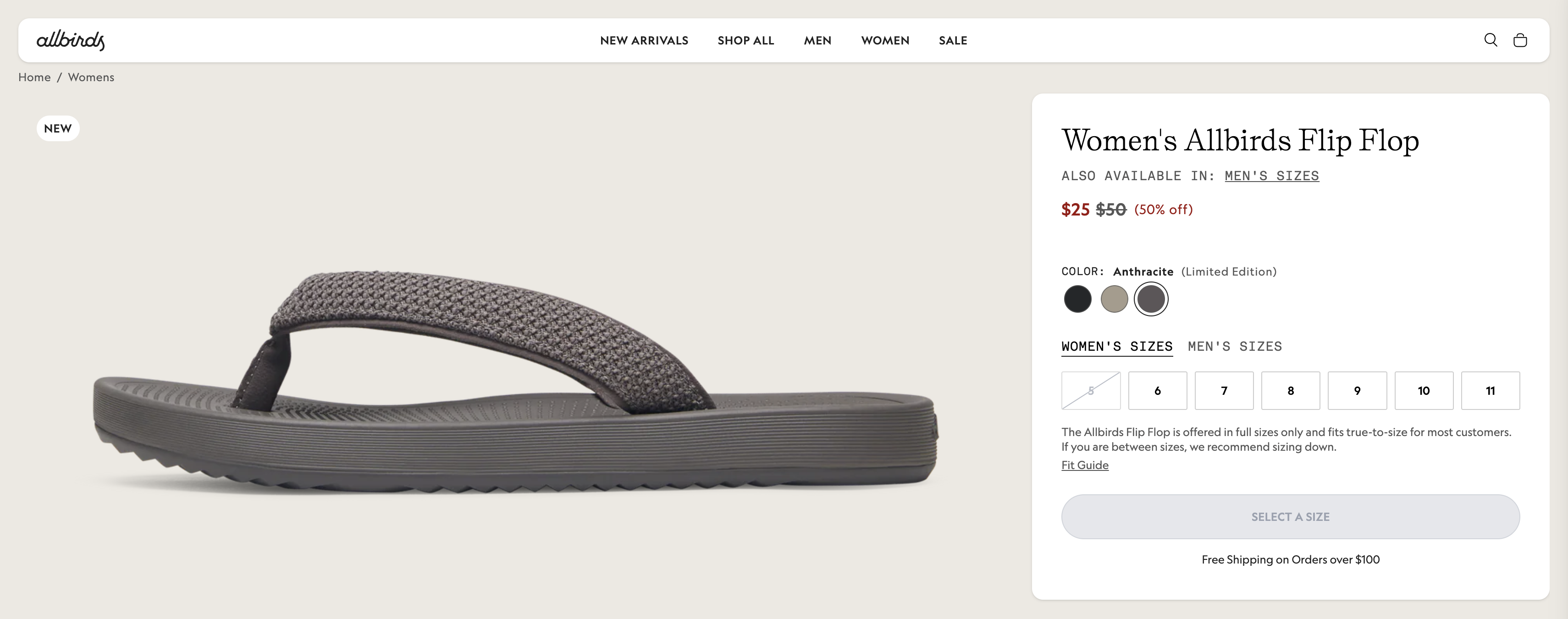
Example of a structured product title with key attributes. Source: Allbirds
Product Images
Images do more conversion work than almost any other element on the page. Customers can't touch or try the product, the images are doing that job for them.
For most stores, this means multiple angles, at least one lifestyle shot showing the product in context, and close-ups of any detail that matters to the purchase decision (texture, hardware, finish). For apparel, images on a model are non-negotiable. For products where size is hard to judge, include a scale reference.
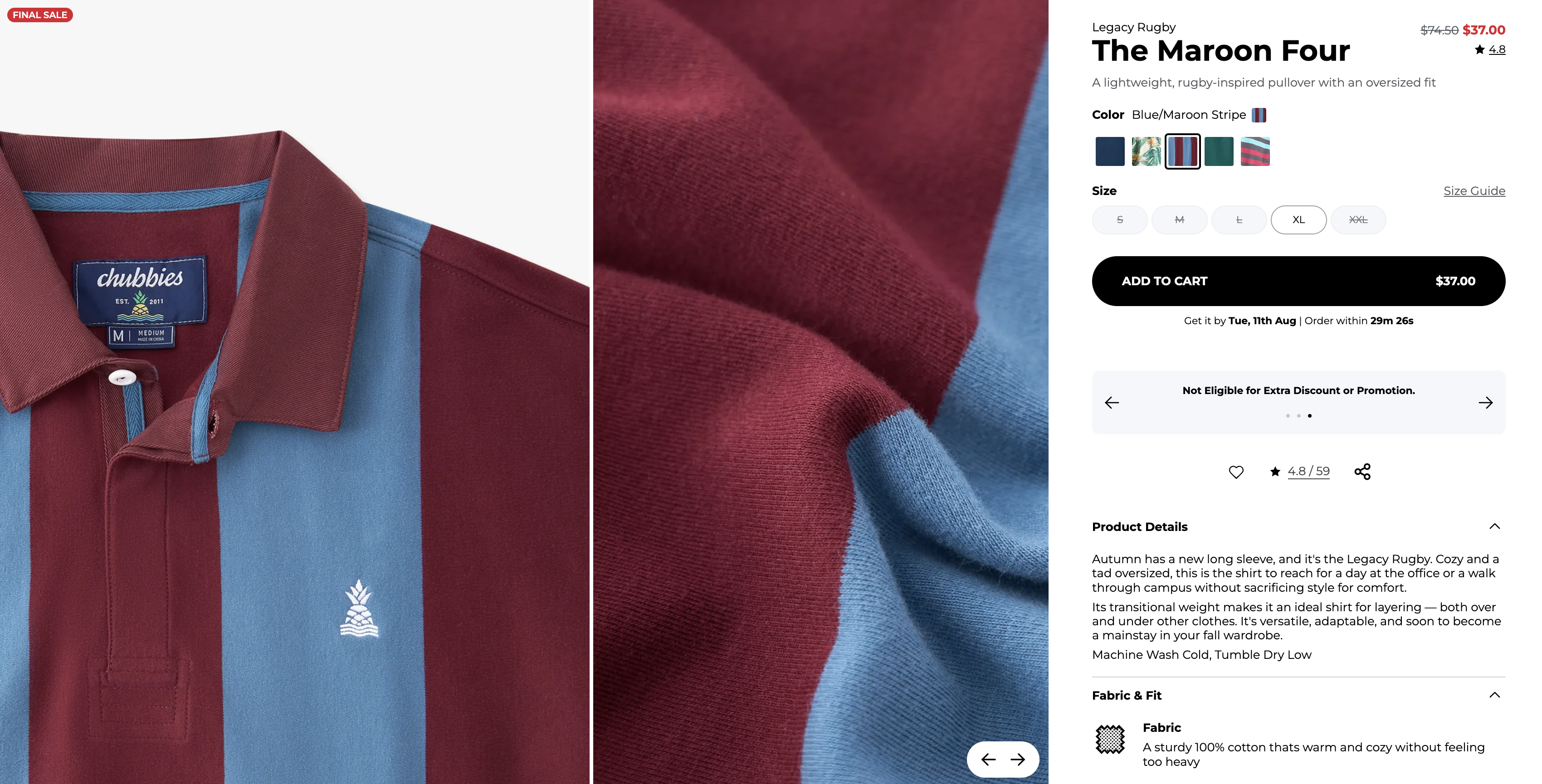
Example of multi-angle product photography with lifestyle and detail shots. Source: Chubbies
Image quality also affects SEO, search engines favor well-optimized, high-quality images in results pages, so it's worth getting the file naming and alt text right too.
Product description
The description should answer the question a customer is likely to have before they'll add to cart. What is it made from? How does it work? What size should I choose? What makes it different from the cheaper option?
The right length depends on the product and the customer. A straightforward consumable might need three sentences. A considered purchase: furniture, specialist equipment, something with technical complexity, might need several paragraphs and a spec list.
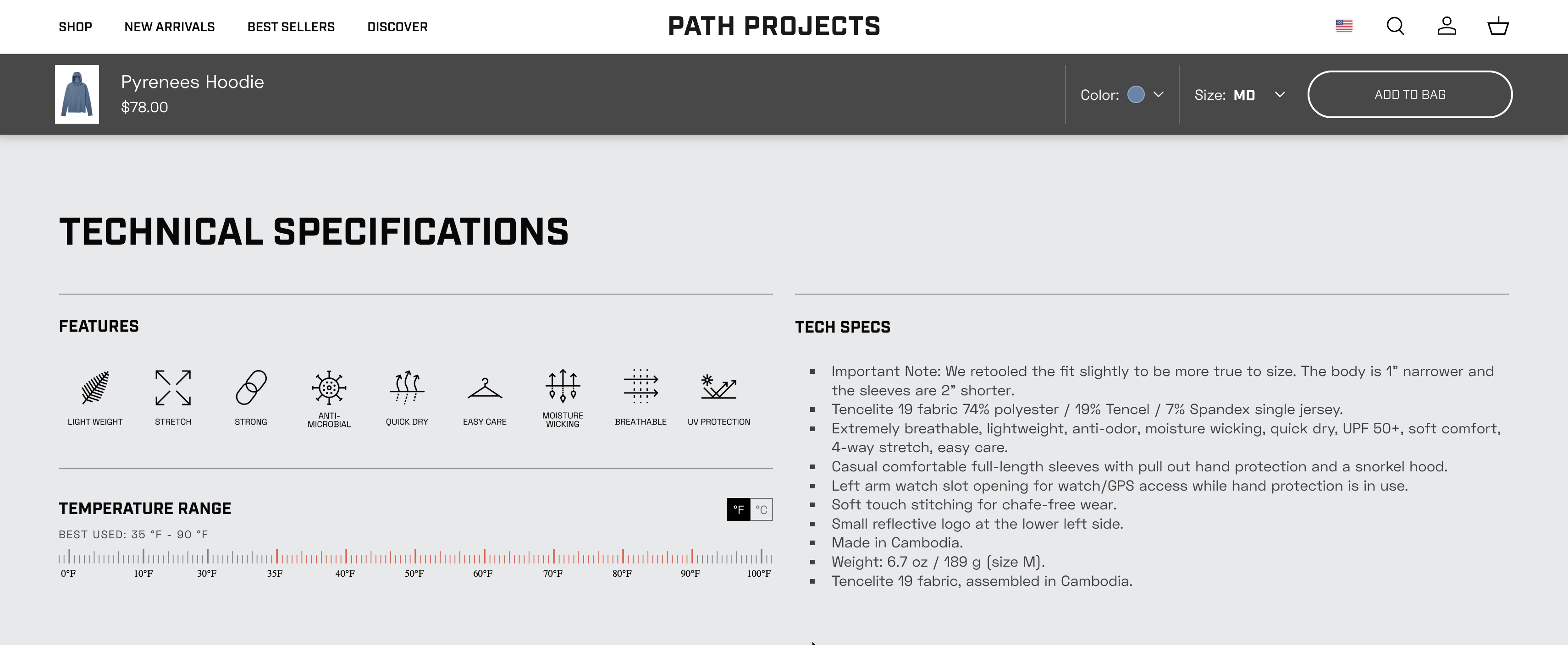
Example of a detailed, factual product description. Source: Path Projects
One thing that consistently underperforms: generic descriptions that could apply to any product in the category. Specific, factual copy converts better than vague benefit statements.
Product video
Video is worth adding where it helps the customer understand the product better, how it assembles, how it wears and how a texture looks in motion. Not necessary for every product, but for anything where static images don't tell the full story, it's worth considering.
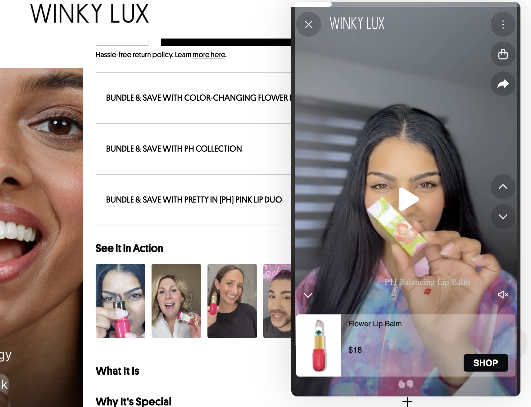
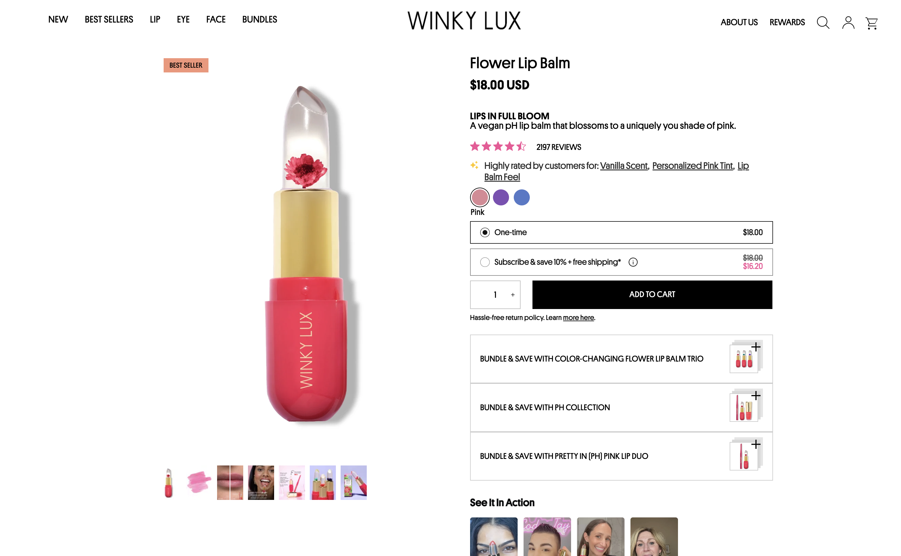
Example of a product video embedded on a product page. Source: Winky Lux
Shipping information
Customers want to know delivery timelines and costs before they commit to buying. Hiding this information until checkout is one of the most common causes of abandonment. Surfacing estimated delivery times and any shipping thresholds (free shipping over a certain order value, for example) directly on the product page removes a friction point at the right moment.
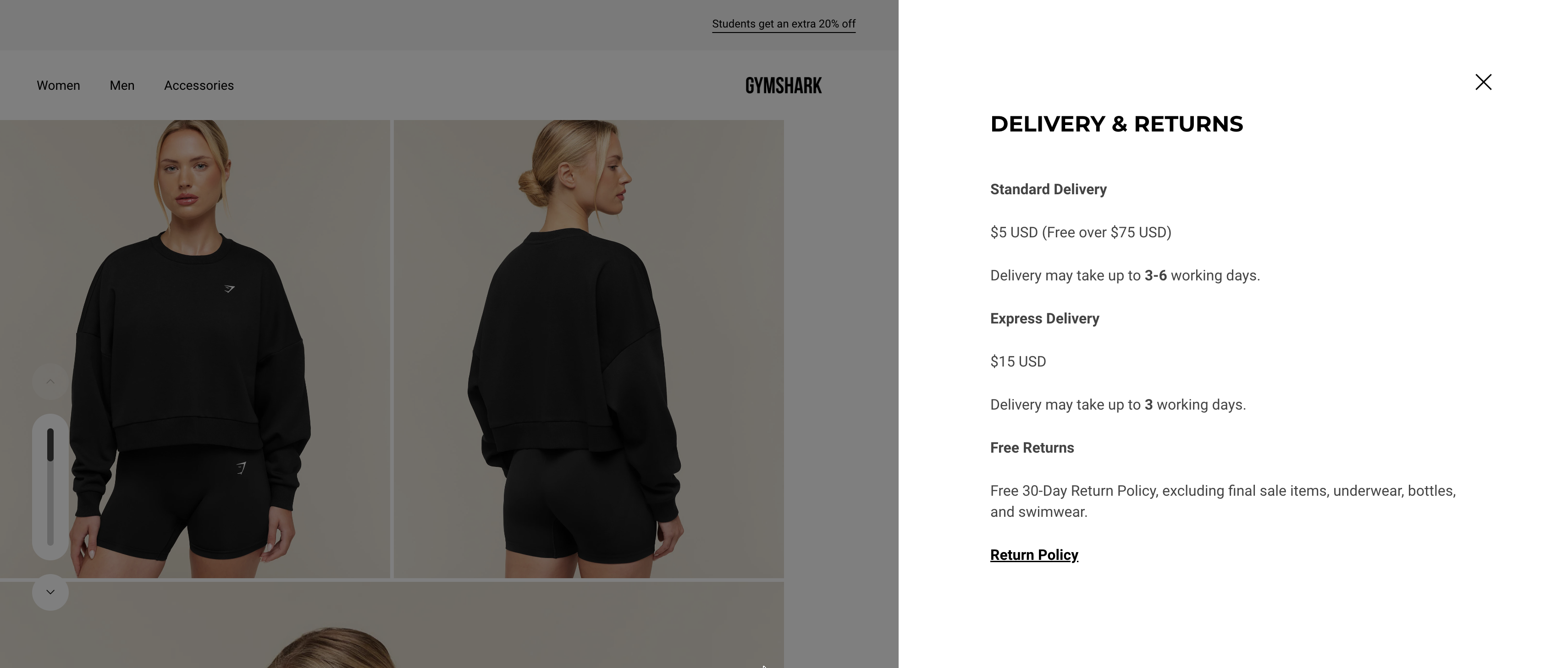
Example of delivery timelines and thresholds surfaced on the product page. Source: Gymshark
Customer reviews
Reviews reduce purchase uncertainty, particularly for new customers. Volume matters, but so does recency, a product with 200 reviews from three years ago and nothing recent raises questions. A steady flow of recent reviews signals an active, healthy product.
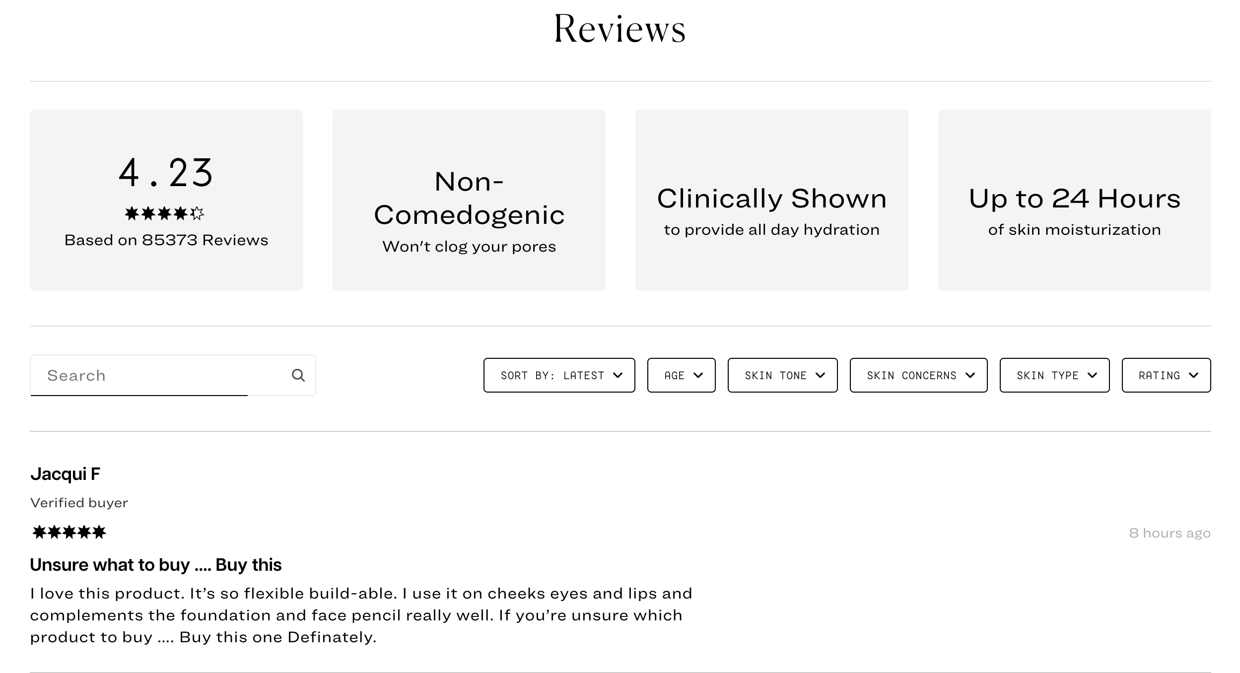
Example of a customer reviews section with recent ratings. Source: Jones Road
Beyond the aggregate rating, reviews answer questions the description didn't. Customers write about fit, durability, packaging, scent, things that build trust and address objections before they form.
FAQ section
A short FAQ section on the product page handles the questions that come up repeatedly in customer support, and handles them at the point where they matter most. Common questions around sizing, ingredients, compatibility, or care instructions belong here rather than buried in a separate help section.
Add-to-cart CTA
The add-to-cart button needs to be easy to find, clearly labelled, and visible without excessive scrolling, particularly on mobile. It sounds obvious, but sticky add-to-cart bars and well-positioned CTAs consistently improve conversion on longer product pages.
Subscriptions
If a product lends itself to repeat purchase, surfacing a subscription option on the product page is worth doing, with clear messaging about what the subscriber gets (discount, convenience, flexibility to pause or cancel).
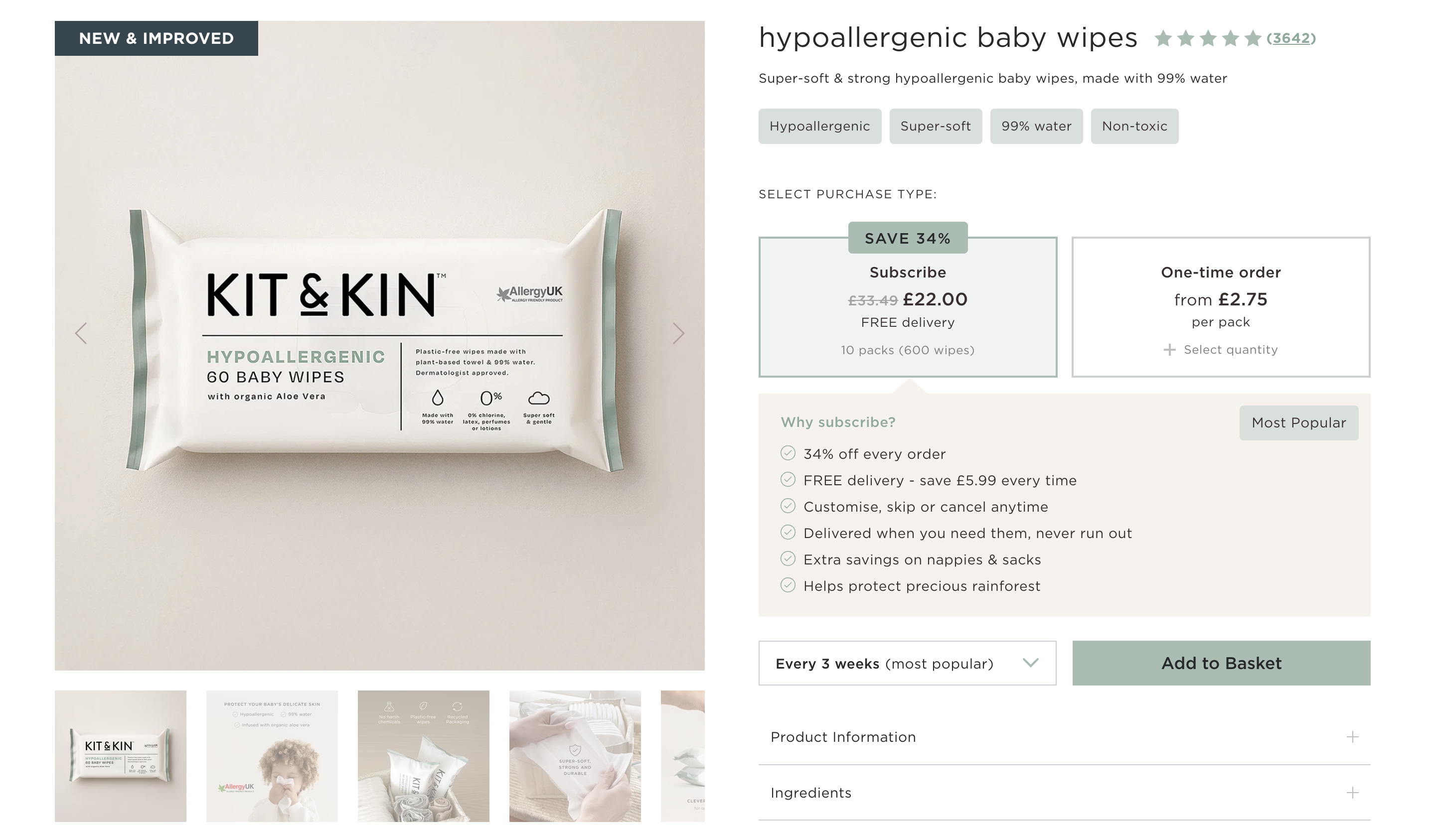
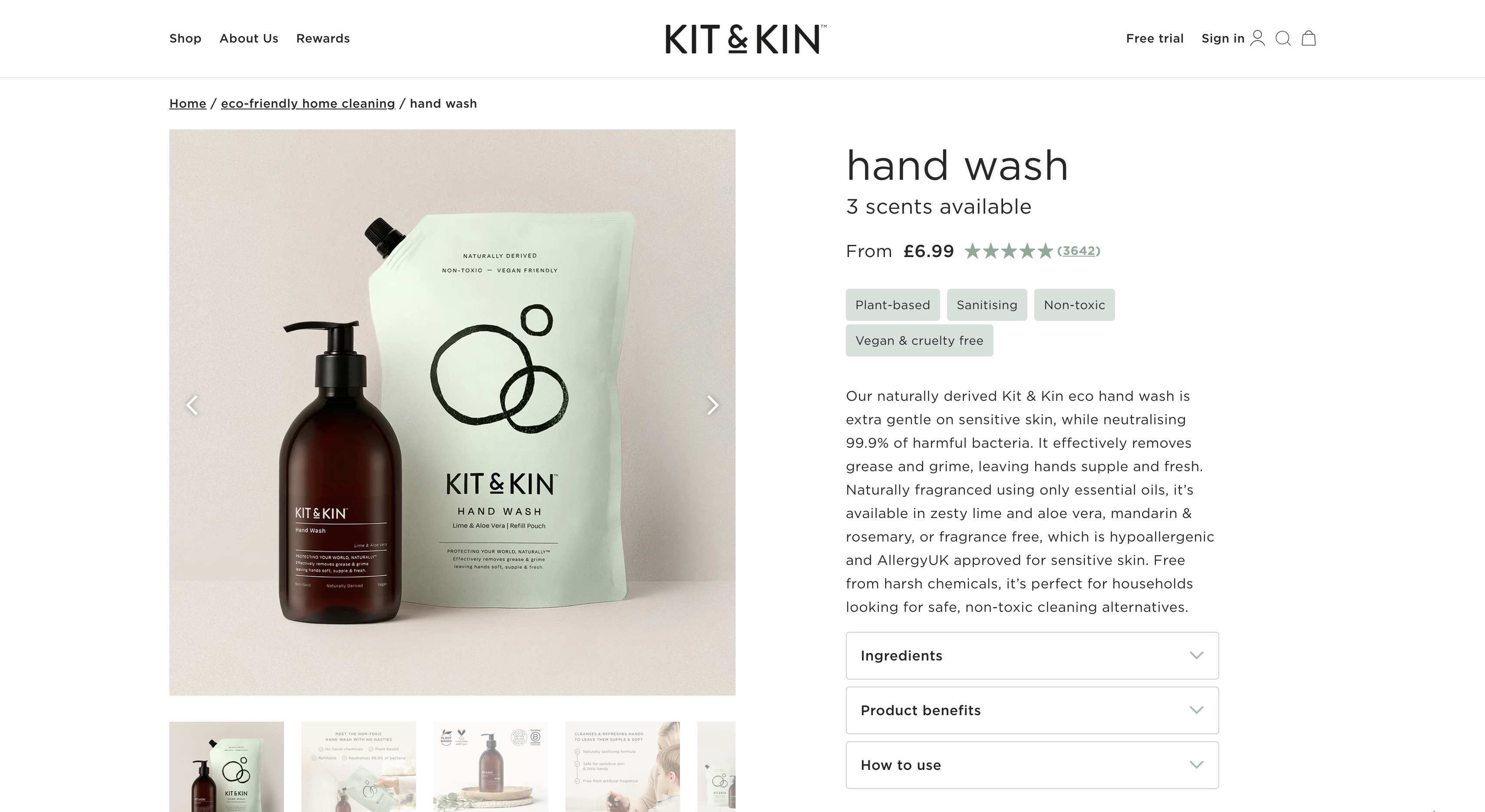
Example of a subscription option surfaced on a product page. Source: Kit & Kin
Subscription options that aren't clearly explained or that bury the terms tend to underperform. The ones that convert well make the value proposition obvious without requiring the customer to hunt for the details.
Upsell and cross-sell sections
Upselling (suggesting a higher-value or complementary version of the product) and cross-selling (surfacing products that go well with what the customer is viewing) both work best when the recommendations are genuinely relevant. A "you might also like" section populated with unrelated products adds noise rather than value.
The placement matters too. Upsell sections below the fold tend to work well for considered purchases where customers are already engaged. For faster-moving products, cart-level upsells often outperform page-level ones.
A note on what doesn't need to be on every page
Not every product needs every element above.
A simple, low-consideration product page with clear images, a concise description and a well-placed CTA will outperform a cluttered one that's added every available section.
The goal is to give the customer what they need to make a confident decision, not to fill the page.
Examples from stores we've built
Winky Lux - the product page is clean and concise, with high-quality images, a demo video, a brief FAQ section, an ingredients list, customer reviews, and relevant bundle and cross-sell recommendations. It gives the customer everything they need without overloading the page.
Kit & Kin keeps the product page clear while still giving customers plenty of useful detail. It combines strong product imagery with detailed descriptions, scent and format options, ingredients, product benefits, usage guidance, FAQs, reviews and related product recommendations - all without making the page feel overloaded.
If you're looking at a product page that isn't converting at the rate it should, the issue is usually in one of the areas above.
Get in touch if you'd like us to take a look.