Scandinavian website design is known for its utility and minimalism without excessive details. It has gained notable popularity over the past ten years. And now, this aesthetic goes beyond home decor.
Many eCommerce businesses opt for Nordic website design: some do it merely to keep up with the trend, while others do so to embrace the values and vision of the Scandinavian style.
If you also want to launch your store with Scandi web design, let us offer you some inspiration. As an expert Shopify design vendor, GenovaWebArt has gathered the best Scandinavian website design examples for you. So let’s get started.
Table of Contents
- Why Is Scandinavian-Style Website Design So Popular?
-
The Best Scandi Websites for Online Store Design Inspiration
- Folk Interiors: Nordic Furniture Online Store
- Nordic Nest: Scandi Home Decor Online Store
- The Nordic Sock Company: Nordic Socks Website
- Acne Studios: Scandinavian Clothing Website
- 2Modern: Nordic Ware Website
- Fjällräven: Nordic Gear Online Store
- Helle Norway: Nordic Knife Website
- Scandi Kitchen: Scandinavian Food Store
- Silke Bonde: Nordic Craft Online Store
- Simple Form: Scandinavian Interior Design Store
- Tips and Tricks for Nordic-Style Online Store Design
- Our Experience in Minimalist eCommerce Store Design
- Final Thoughts
- FAQ
Why Is Scandinavian-Style Website Design So Popular?
Scandi design is prominent, indeed. Simplicity, functionality, neutral colors combined with softened dark shades, some color accents, and natural patterns: here are a few words to describe this style.
But why do eCommerce companies choose Nordic web designs in the first place?
The Scandinavian style aims to improve everyday life. It doesn’t matter whether it applies to the creation of furniture or the design of eCommerce stores — its core ideas are practicality and convenience.
We can also note that the Scandi design is about a customer-centric approach, where you prioritize the ease of use of your website along with its clean look.
Despite all this simplicity, online stores with Scandinavian web design aren’t bland. On the contrary, they are rather refined with their twist. You are unlikely to confuse the Ikea website with any other: white background, full-screen product photos, and a few bright accents to grab your attention.
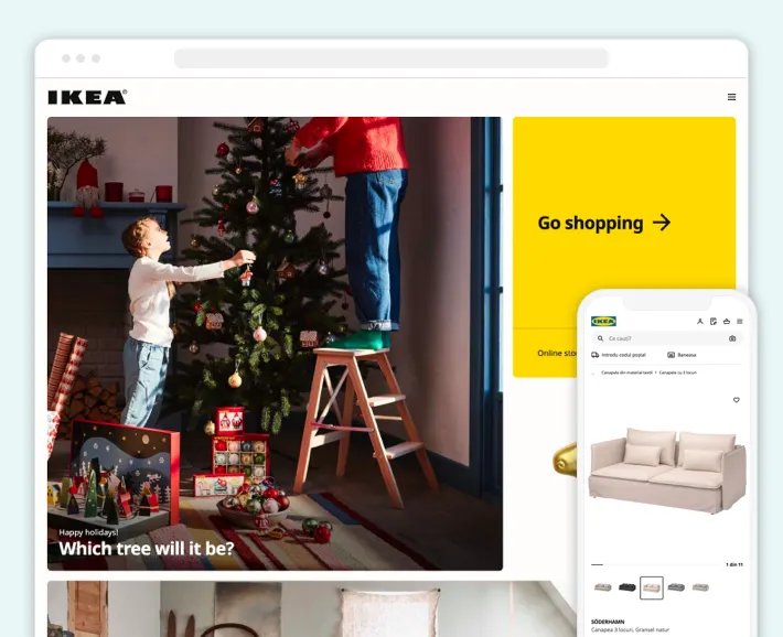
Thus, the secret of Scandi-style online stores’ popularity lies in the ability to offer customers an impeccable shopping experience, focusing on ease of use, straightforward functionality, and a non-oversaturated look.
The Best Scandi Websites for Online Store Design Inspiration
Let’s dive into the Scandi website design by following the prominent online store examples. We’ve gathered the top ten eCommerce businesses in Nordic style:
1. Folk Interiors: Nordic Furniture Online Store
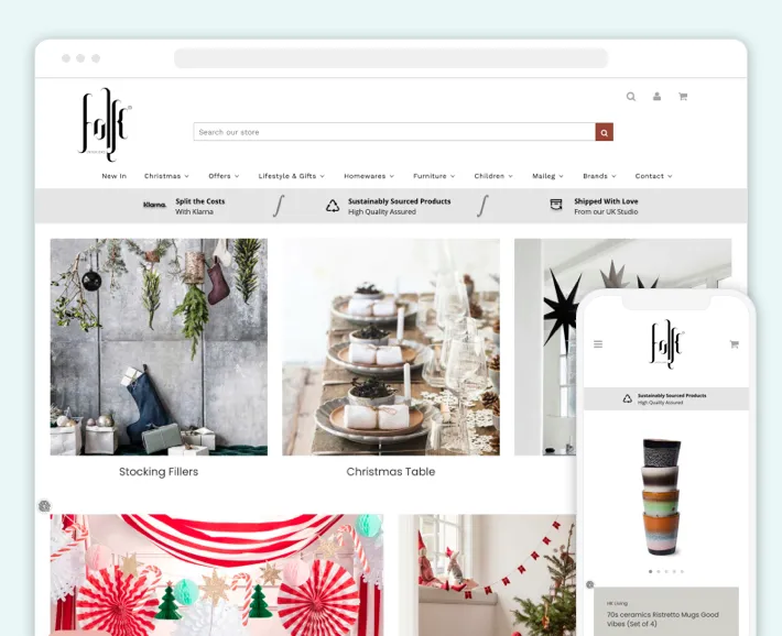
Folk Interiors is a furniture and homeware eCommerce store representing such Nordic brands as Broste Copenhagen and HK Living. You can notice the Scandinavian style web design just right after opening the store. White background, pastel colors, and a delicate logo that stands out, combined with thoughtful navigation, make this website a convenient shopping destination.
2. Nordic Nest: Scandi Home Decor Online Store
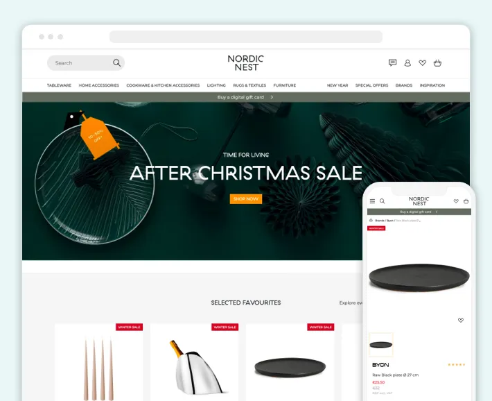
Nordic Nest is a home decor online store with Normann Copenhagen, Ferm Living, and Kay Bojesen brands included. Customers can shop for furniture, tableware, kitchenware, textiles, and other home accessories using a minimalistic website with a сlear menu tab and extensive search features.
3. The Nordic Sock Company: Nordic Socks Website
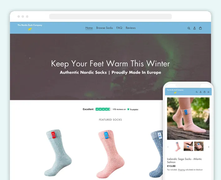
Check out the Nordic Sock Company, a brand of authentic Nordic socks, as an inspiration for your clothing store. The website greets you with the northern light animation on the main page. Then, scrolling further, you see a simple layout with all available products.
4. Acne Studios: Scandinavian Clothing Website

Acne Studios, a Stockholm-based fashion brand, strikes you with its minimalist website. The main page of this online store includes a simplistic navigation bar at the top, with photos of clothing and accessories taking up the rest of the space. Acne Studios came up with the best way of demonstrating available products.
5. 2Modern: Nordic Ware Website
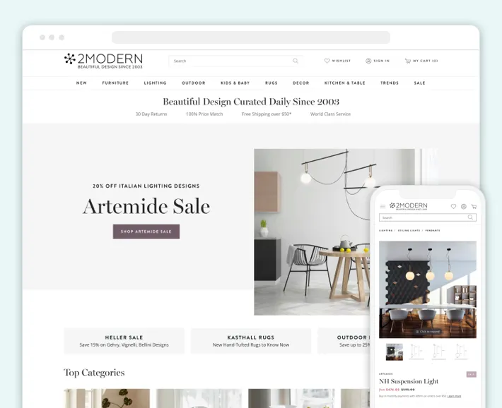
2Modern offers from table and kitchenware to home decor and furniture. This online store features brands such as Ferm Living, Muuto, and Mater, thus offering the best Scandinavian products. You can also appreciate the Nordic web design theme.
6. Fjällräven: Nordic Gear Online Store
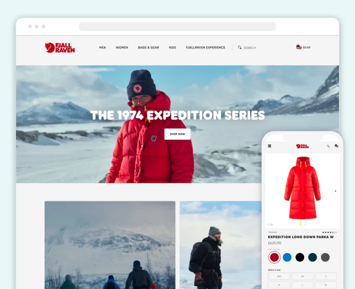
Fjällräven is a Swedish company that specializes in hiking gear. Their online store has a distinctly Scandinavian aesthetic focusing on natural themes, muted hues, and a simple design.
7. Helle Norway: Nordic Knife Website
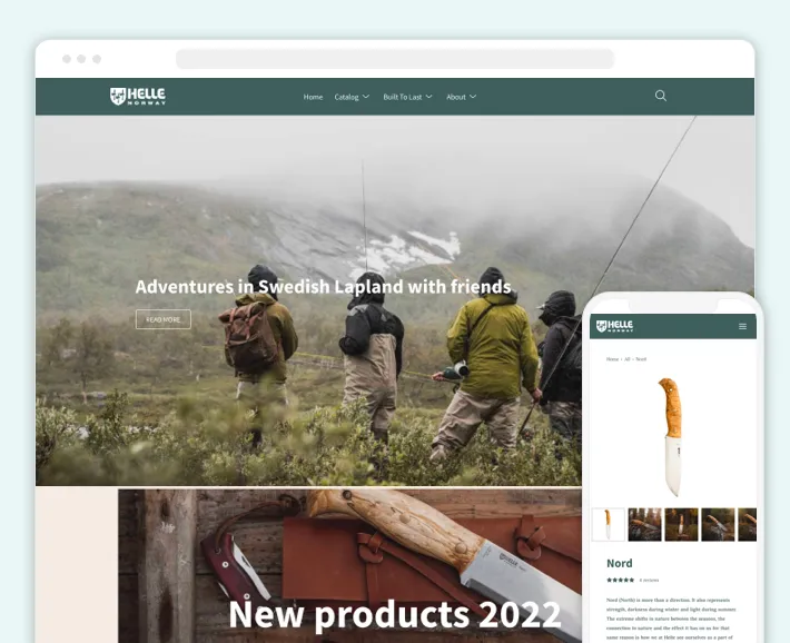
Helle Norway specializes in making and selling knives. The company’s guiding principle is to produce only the highest-quality blades using manual processes and conventional technologies. The website features adventurous and natural themes that allude to their handcrafted knives with hardwood handles.
8. Scandi Kitchen: Scandinavian Food Store
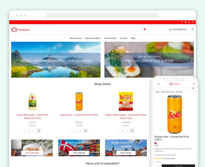
Scandi Kitchen is a UK-based online store offering the best Scandinavian food from Norway, Sweden, Denmark, and Finland. The white background and red color, seen in the logo and throughout the website, make this store Scandi-inspired.
9. Silke Bonde: Nordic Craft Online Store
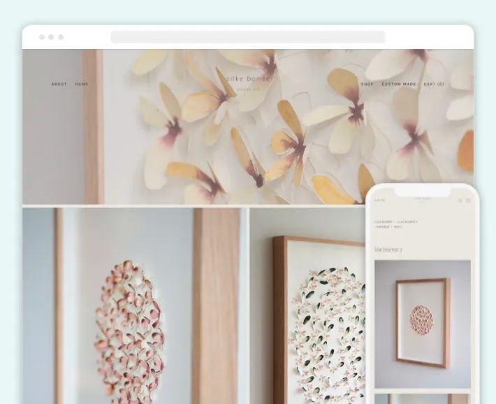
Silke Bonde is a Danish paper artist. Her dedicated online store is the pinnacle of Scandinavian minimalism. Here you can order custom-made prints or simply enjoy gallery-like website design.
10. Simple Form: Scandinavian Interior Design Store
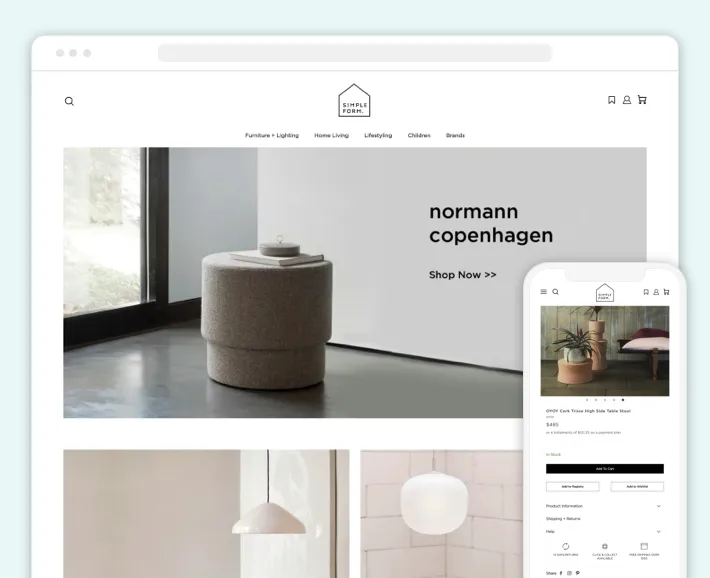
Simple Form is one of the best retailers of Scandinavian furniture, lights, and home accessories. Customers can get everything they need for interior design through this convenient Scandi-style website. As the store’s name suggests, the website’s layout is clean and minimalistic.
You can also check out the 30 best eCommerce beauty stores .
Tips and Tricks for Nordic-Style Online Store Design
While those Nordic online store design examples may inspire you, how can you achieve such design solutions yourself? Here are a few tips from us:
Mind Your Content and Features
Ensure you don’t overload your eCommerce website with unnecessary content and features all over the screen. It may distract and even irritate your customers. So think carefully through the content hierarchy of your online store.
Consider Imagery
The minimalist Scandinavian design does not mean you need to forget about imagery in your online store. As seen in the examples above, Nordic-style websites tend to use large and high-quality product imagery, supplementing it with small description text.
Leave Enough White Space
Scandinavian design involves significant use of neutral and light colors. Plus, Nordic eCommerce websites often use white for the background. Yet, it’s crucial to make your online store spacious and purposefully leave empty areas, in addition to making the background a muted color.
Our Experience in Minimalist eCommerce Store Design
GenovaWebArt has been developing and designing eCommerce websites on the Shopify platform for over ten years. During this time, our experts helped more than 200 online stores boost their sales and attract more customers.
We have broad expertise working with startups and enterprises in various niches. Thus, our team can provide you with minimalist Scandi online store design services as well. By the way, if you are interested in creating an e-commerce website, you may be interested in the cost of such a solution. Especially for you, we have prepared an article on the cost of an e-commerce website.
Check out our minimalist online store example:
Paper Republic
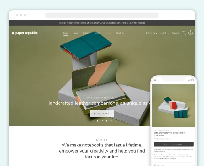
Imagine anything paper-made. A notebook?
Paper Republic has got you covered with anything made of paper. They craft and sell various notebooks, planners, and calendars with stationery on top. The company also offers leather covers, pen holders, and even wallets.
The GenovaWebArt team helped Paper Republic develop a Shopify website and deliver a top-notch simplistic design. We implemented a small navigation bar at the top of the online store and filled the rest of the website with high-quality product images. Another decision that added minimalism was the use of a non-capitalized font.
You can look through even more projects in our portfolio, including the best sporting goods shops.
Final Thoughts
Creating a Scandinavian design website is a decent idea. Whether you want to follow the latest trends or appreciate the Nordic style: any reason will eventually end up in an online store attractive to customers.
We hope this article helped you get ideas for your eCommerce website. And if you need someone who can bring it to life, GenovaWebArt specialists are at your service. Contact us, and we’ll deliver a Scandi-style online store for you.
By the way, we recently created a guide comparing Shopify and WooCommerce, so if you haven’t created your store yet, this might be useful for you.


