Eight seconds. That’s how much time you’ve got to keep your Shopify store customers’ attention. Do you think it’s quite a short span? You’re certainly right.
But what can you do to attract and retain as many customers as possible? Well, one of the strategies is to design your Shopify homepage right. On top of that, you’ll be able to introduce your brand and help your clients navigate your shop better.
A perfect Shopify website homepage engages customers, encourages action, and increases sales. How can you create one? Find out in today’s article.
As a certified Shopify expert, GenovaWebArt will tell you about the best design practices and the main elements to include on your Shopify store homepage. We’ll also show you how to make your store successful, taking our projects as an example.
Table of Contents
- Why Your Shopify Store Homepage Is So Important
- What Should a Great Shopify Home Page Contain?
- Order of the Elements on the Shopify Main Page
- 5 Great Examples of Shopify Home Pages
- Best Practices for Your Shopify Homepage Design
- Improve Your Shopify Homepage Design Over Time
- Proper Shopify Home Page Design and SEO
- Start Your Custom Shopify Homepage with GenovaWebArt
- Final Thoughts
- FAQ
Why Your Shopify Store Homepage Is So Important

Why do we recommend paying attention to the Shopify shop front page to attract and retain customers? The reasons are quite simple. Here are the main ones:
Homepage Gets the Most Attention
Your eCommerce store’s homepage is the first thing your potential and existing customers visit. If they find it challenging to navigate or locate what they need, you risk losing them. It’s best to avoid such risks and take care of a proper website front page design right away.
Homepage Communicates Your Brand’s Vision
Your homepage not only makes the shopping experience easier and conveys your brand’s identity. Attract customers who share and value your vision and show where your brand can take them.
Well-Organized Homepage Boosts Sales
Of course, if your Shopify website homepage offers a clear flow, the buyer will reach the desired result in your store faster. Simply put, the better you structure your front page, the easier it is for the customer to make a purchase and, as a result, the more sales you get.
Homepage Improves Your Store’s SEO
A thoughtful structure of your homepage also guarantees improved SEO. Your online store will rank higher in search results primarily due to better navigation.
Read also: How to Create an Effective About Us Page on Shopify for Higher Conversions
What Should a Great Shopify Home Page Contain?
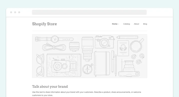
Let’s now see what a decent Shopify homepage design should consist of. Here are the essential elements:
Easy Navigation Bar
The navigation bar is a section of your homepage that gives your customers instant access to basic information and features of your shop.

Search Bar
The search bar is a must for any Shopify store. Enable your customers to discover products by keywords and set up relevant filters for better results.

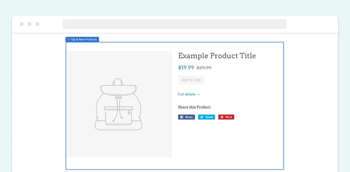
Top and New Products
Add a tab with the top and new products to your homepage. In this way, buyers can familiarize themselves with the current best offers.
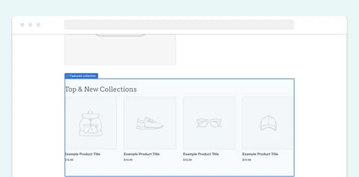
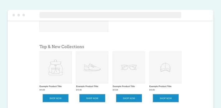
Top and New Collections
This element is somewhat similar to the previous one. But here, instead of a list of the best products, customers can simultaneously view the top collections in different categories.
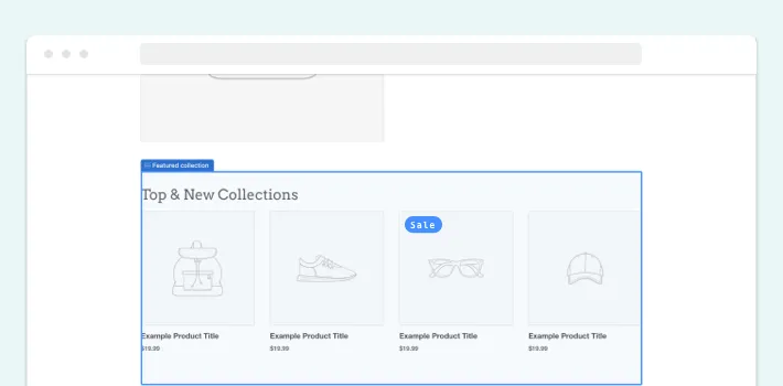
Sales
You should also add a sales tab to your store’s homepage.
“Shop Now” Buttons
“Shop Now” is another essential element on your Shopify website homepage. It assists in promoting particular products.
Compelling CTAs
Add various calls-to-actions (CTAs) to your homepage. For example, it can be a prompt to purchase a product and other advertising messages.
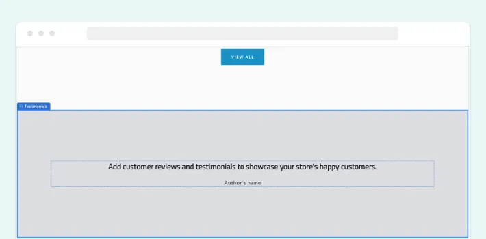
Client Testimonials or Social Proof
At the bottom of your home page, you can add client testimonials. In this way, you can make your store more trustworthy.
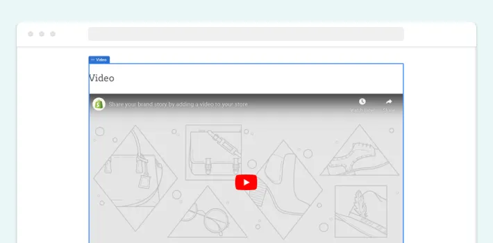
Video and Animations
Videos are a great way to introduce your customers to your brand and products. And animations, in turn, will make your homepage more interactive and engaging.
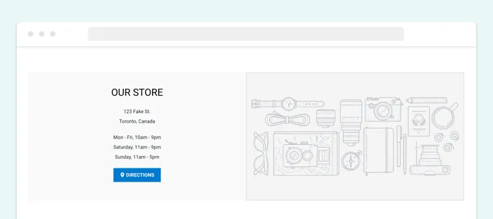
Contact Information
Of course, your contact information should be listed on the homepage. It will help customers contact you if they have questions or experience any issues.
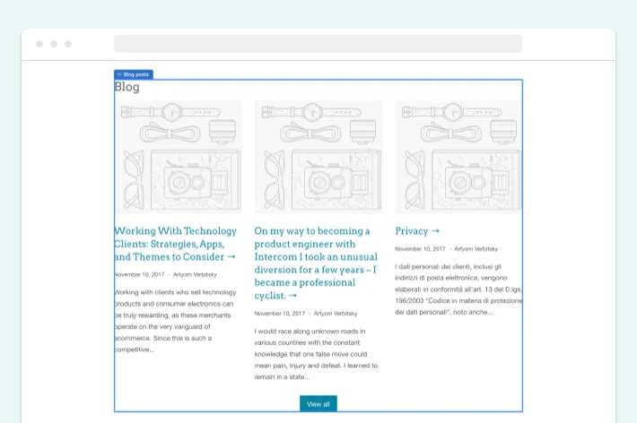
Insights or Blog Articles
This element of your homepage will have a multipurpose application. Thanks to a blog, you can improve SEO and familiarize your customers with the products you offer better.
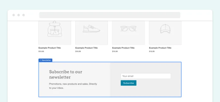
Subscription
We suggest adding an email subscription feature on your home page. This way, you can regularly send offers to your customers.
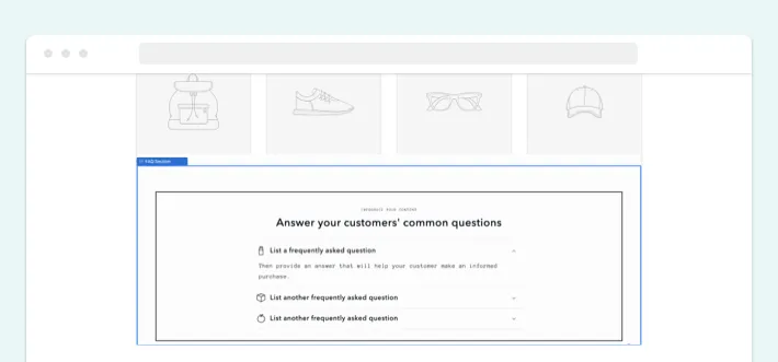
FAQ Section
Another element you need to include on your Shopify website homepage is the FAQ section. List the most common questions to facilitate customer interaction with your store.
Order of the Elements on the Shopify Main Page
How you organize Shopify store homepage directly influences your sales and brand perception. Let’s take a look at the order to place elements of your store for the best performance:
- Navigation and search bar
- Direct call to action
- Top & new products
- Top & new collections
- Sales
- “Shop Now” buttons
- Insights, video & animations
- Client testimonials
- Contact information
- Subscription
- FAQ section
5 Great Examples of Shopify Home Pages
See how you can implement the structure of a quality Shopify homepage, getting inspired by real examples. We’ve prepared some of the most awesome ones:
Kit and Kin
Kit & Kin is a UK-based company that supplies nappies and other baby care products. Their purpose is to relieve the parents’ stress by providing them with high-quality, sustainable, and hypoallergenic goods.
GenovaWebArt helped Kit & Kin change home page on Shopify. We made a convenient navigation bar where the customer can choose the relevant category or scroll down the homepage to see the main offers.

Ten Thousand
Ten Thousand is a company from the USA that specializes in selling sportswear. We helped the store owner implement a minimalist design focusing on powerful imagery. We also made a detailed navigation bar that allows website visitors to select the clothing category they are interested in, view information about Ten Thousand ambassadors, and more.

Winky Lux
Winky Lux is a New York-based brand selling various types of beauty products. Our team came up with fancy visuals, added “Shop Now” buttons, and implemented categories with best sellers and gift options. In addition, the website throws up a pop-up with current special offers, encouraging customers to make purchases.

PopSockets
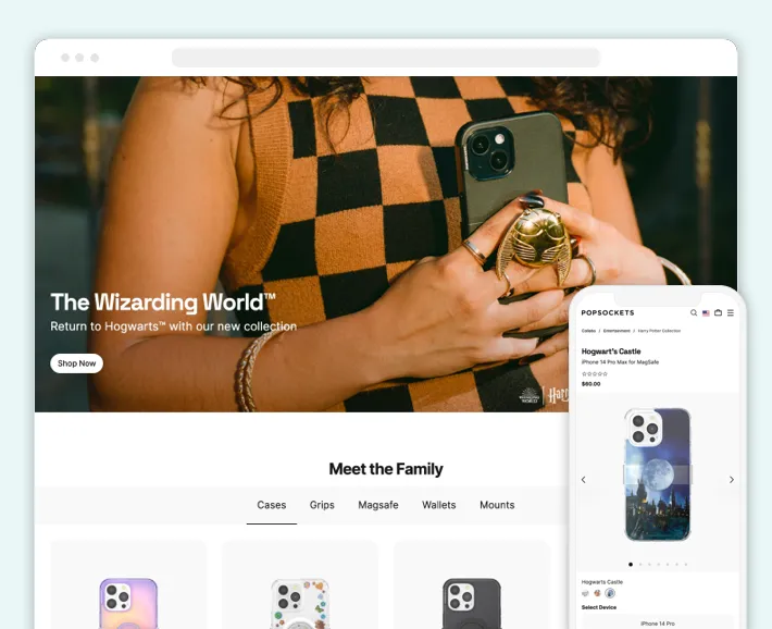
PopSockets attracts the customers’ attention with vivid colors and outstanding visuals. This online store wisely uses trendy design solutions with relevant CTAs.
Hunterhue
Hunterhue is a brand that supplies handmade artistic jewelry pieces. Their online store conveys minimalism and is straightforward from the user’s point of view. With this homepage design strategy, Hunterhue could draw customers’ attention to their items.

Best Practices for Your Shopify Homepage Design
Let’s say you have placed the elements of your online shop in the correct order. Perhaps you have also got inspired by successful eCommerce websites’ examples. What else can you do to organize a Shopify store homepage better? Here are a few suggestions:
Keep User Experience in Mind
Design your homepage focusing on your users first. Even if your online store has an attractive appearance, without a well-thought-out UX, it won’t be easy to succeed.
Remember that your homepage should be intuitive and simple. You can achieve this by thinking through the user flow in your online store.
Choose Suitable Fonts and Color Scheme
Once you’ve taken care of your homepage’s UX, you can move directly to the look of your online store. Let your brand identity guide you when choosing fonts and color schemes.
In addition to consistency with your brand, the chosen fonts should be readable, and the colors should be clean and not too tiring for the customers’ eyes.
Consider the Mobile Homepage Design
Nowadays, more and more people accomplish their daily tasks right from their smartphones. The same applies to online shopping. So optimize your homepage design for mobile devices.
Learn more about How to Optimize Shopify for Mobile in our recent blog post.
Display a Pop-Up at Exit Intent
Showing a pop-up to customers leaving your online store is a decent way to increase conversion rates and drive clients to action. Therefore, consider this element when designing your homepage.
Improve Your Shopify Homepage Design Over Time
Another way to modify Shopify home page right is to remember that this is a never-ending process. You need to constantly evolve to meet the demands of modern customers and stand out from your competitors.
But how to understand that it’s time to customize your design?
Many factors affect the relevance of your store’s homepage. In particular, you consider customer demographics, new product launches, your branding strategy, or even new marketing channels. Based on the aspects like this, you can determine whether your homepage needs modifications.
Thus, looking at your online store as a project with uncertain deadlines is best. When you feel it’s time to change the design (By the way, did you know that e-commerce in a Nordic style is very popular right now?), add new features, etc., do it and stay on top.
Proper Shopify Home Page Design and SEO
SEO greatly affects the visibility of your eCommerce website. When everything is right in place, it’s easier for customers to find you and start shopping. After all, search engine optimization impacts the overall growth of your business.
As already mentioned, a well-thought-out structure and well-delivered design play a crucial role in Shopify SEO optimization. For example, if a customer can find the product they need in a few clicks, this can potentially guarantee your website a higher ranking in search results.
Thus, create a Shopify main page with SEO in mind.
Start Your Custom Shopify Homepage with GenovaWebArt
If you’re wondering: “Who can optimize my home page in Shopify?”, GenovaWebArt is your best choice. And here’s why.
First and foremost, we are certified experts in Shopify. You can leverage our extensive expertise to deliver top-notch online store design solutions. Since 2012, we’ve made Shopify our primary focus and done our best to excel in this niche. Our proficiency includes utilizing Shopify Plus Flow to automate and streamline complex workflows, enhancing efficiency and personalization for your online store.
Apart from our expertise, you can benefit from our numerous Shopify-related services. They include design, development, QA, project management, and more. That means we can build an online store from scratch, optimize your homepage, customize your website theme, and do anything related to eCommerce platforms.
We also offer reasonable prices, flexible communication, and strict adherence to deadlines. Our experts will follow all your brand requirements and the specifics of your niche. With us, you can quickly handle your Shopify homepage design using best practices and the latest trends.
Final Thoughts
More and more online stores are emerging in the eCommerce market. Each of them comes out with unique design solutions: everything to capture the customers’ attention.
Considering how challenging it can be to keep clients interested, it’s worth knowing how to design your Shopify homepage properly. By modifying your online store’s structure, you can boost your sales, increase conversion, and reach more customers effortlessly.
If you’re considering changing your current Shopify website’s design or need a brand-new solution, GenovaWebArt can help. Our many-year background in developing and designing Shopify products will facilitate that. Contact us anytime to discuss your successful project.


